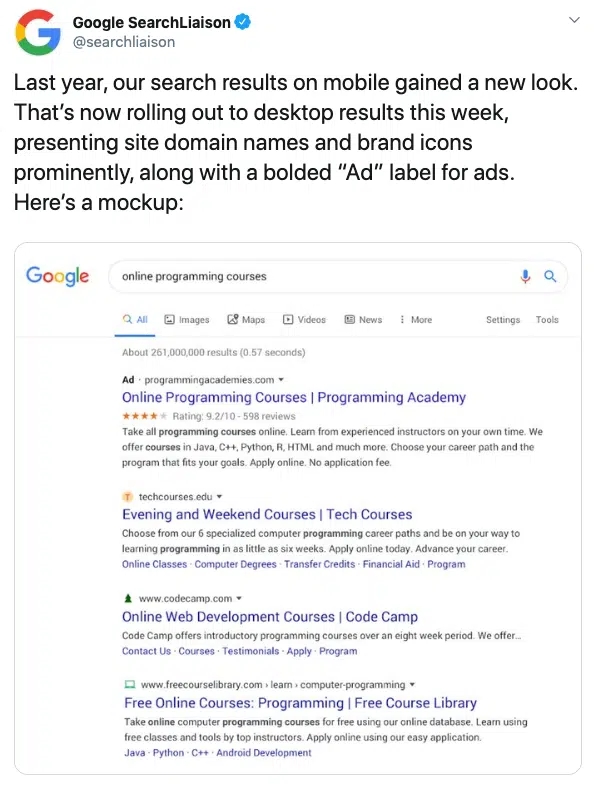
Google Search Ads Redesign On Desktop
Back in May last year, Google started rolling out the new redesign for ads and organic results on mobile.
This new look featured the black ad label and new favicons for organic search results. These changes can be seen in the example below.
Now in January 2020 this redesign has been rolled out onto desktop as well.
This new black ad label replaces the green outlined ad labels that were introduced in 2017.
The new label also appears in the top corner of the ad above the headline for the first time, which Google said is to help users quickly identify where the information is coming from.
We can also see the new favicons in the organic results in the example from Google.
Similar to search ads, the URL now appears at the top of the search result along with a new favicon (logo) in the upper corner, allowing users to easily identify the search result sources.
Related Services
 PPC
PPC
Since then we’ve diversified our Paid Search offering but remain one of the best in the game at PPC.


