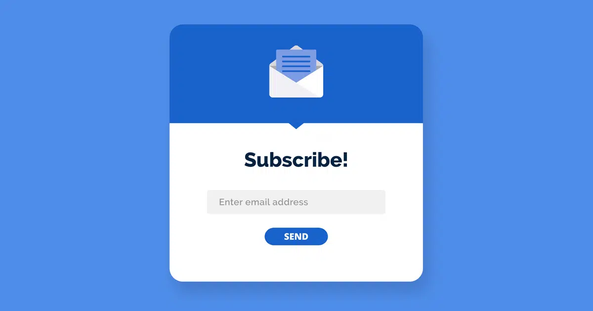
How to Create an Effective Email Sign up Form
Growing your email list is a great way to reach your target audience. One of the best ways to start building a list is to create a signup form on your website, and directing users to this through social media.
Here are a few tips on creating a great email sign-up form.
What is an Email Sign Up Form?
This is a tool that collects subscribers information, by asking users to input details into fields. This allows you to then communicate with them via email.
You can do this by having inline forms on your website – which can be anywhere on your website. You can also have a variety of pop-ups that appear at different times – such as when users land on your website, navigate to a certain page, or go to leave your website entirely. You can also create a landing page form – which is a single page with a purpose to capture subscriber sign ups.
Where to Place Email Sign Up Forms
A good rule is to find the most noticeable but natural placements on your website, so that they don’t interrupt the visitors’ experience on your website. You can also add sign up forms to your Website Footer – meaning that whichever page or blog post visitors are on, they can easily sign up to your email list. You can also add a pop-up on your home page to capture as many visitors as possible. You can also add pop-ups to specific pages, where the sign up is related to the content on the page. A great place to add sign up forms is also on your checkout or thank you pages.
Sign Up Form Content
Here are a few best practices and ideas to include in you email sign up forms:
Clear Headline
Use a clear and concise headline to draw users in
Frequency
Tell subscribers the frequency of emails and when they should expect to receive emails.This creates clear expectations, and also helps with GDPR compliance.
Social Proof
Use social proof by highlighting how many existing subscribers you have, using wording such as ‘Join 5000 others’.
Benefits & Value
Show users what benefits they will receive by signing up – such as Exclusive Discounts. This makes them feel more special compared to others. You can also remind users that it is free to sign up.
Impactful CTA
Add a clear CTA to remind subscribers what’s in it for them. Instead of having the button reading ‘Subscribe’, you could use ‘Send me a free guide!’ or ‘Join now!’
Negative Opt-out
You can also add a negative opt-out for when users want to close the pop-up box – such as – such as ‘I don’t want 10% off’
Easy Fields
Forms with fewer input fields are more likely to increase conversion rates – so keep the fields to a minimum. You can add in just an email address and name fields – and get the extra information later. Having a name associated with your subscriber allows you to personalise your emails.
Sign Up Form Design
The design of your email sign up form is key, and it will help to draw users in to subscribe.
Ensure that your sign up form is branded, with eye catching colours and content. It is also recommended that you only use 1-2 different fonts.
Sign up forms with an image receive 94% more views than those without images, so it’s always good to add an image.
Once you have created your sign up forms, you can test and optimise these. Use A/B testing to see which forms perform best, helping you to change and improve forms across your website. You can then test an optimise your sign up form. Do some A/B testing to see which performs best. Want some help with email marketing? Contact our email experts now to see how we can help you.
Related Services
 Email Marketing
Want to setup an Email Marketing strategy, but not sure where to start? Our Email services help you to get your brand out to new people, and create customer loyalty.


